Lay’s. You spot that yellow bag in the grocery store, and your brain’s already whispering, “Hey, maybe just one more snack won’t hurt.” It’s practically Pavlovian at this point. But look, we’re not talking about chips today. Nope. We’re going full design-nerd mode and deep-diving into that Lay’s logo. You ever really taken a solid look? Most people just see the name and call it a day, but there’s way more happening under the hood.
First Impressions: Friendly, Snackable Vibes
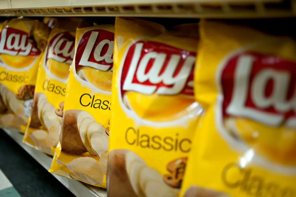
That logo—big, bold red-and-white letters, plopped right on top of a golden yellow background. It’s practically screaming “comfort food,” but, you know, in a nice way. It’s warm. Inviting. Like your grandma offering you just one more cookie. The color palette’s not random either—yellow’s all about happiness and energy. Subtle, but it works. You see the bag, and, bam, instant good mood. But let’s not stop there, because Lay’s didn’t just want you to feel hungry—they wanted to slide in a secret or two.
The Potato That’s Hiding in Plain Sight
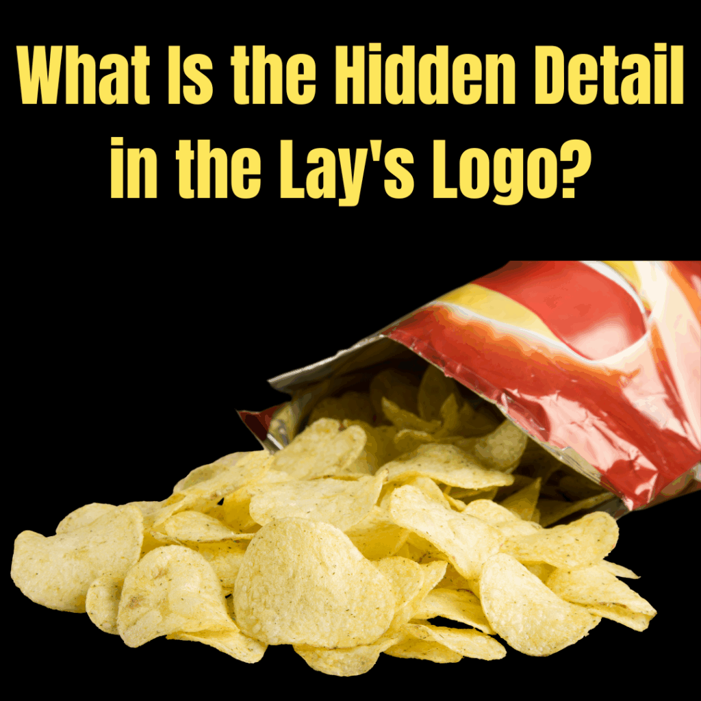
Okay, so here’s where things get spicy (well, as spicy as potato chip logos get). Check out that swoopy yellow swirl behind the Lay’s text. It’s not just some artsy background. Nope, they designed it to look like a potato. Or a chip. Or sometimes both, honestly. In some versions, it’s this perfect golden arc that looks like a chip flying through the air, mid-flip, doing a little snacky somersault. Back in the late ‘90s, early 2000s, they leaned even harder into the potato vibe. Sometimes it almost looked peeled. It’s like a miniature potato drama playing out behind the scenes.
You gotta respect the slyness. They’re basically whispering, “Hey, remember what’s inside this bag?” But not in your face. It’s more like a wink.
Why Are Brands So Obsessed With Logo Secrets?
Here’s the thing—big brands live for this stuff. They don’t just slap a name on a bag and call it a day. They’re in the business of planting little ideas in your head. That swirl? It’s working overtime: it’s eye-catching, it’s got the color and shape of a fresh chip, and it’s got this energetic, snack-time feel that says, “Hey, we’re fun, not stuffy.” It’s all about vibes, not just visuals.
But also, branding is a game of mental gymnastics. They want you to connect the logo with the actual product, but in a way that you don’t even notice you’re doing it. It’s like inception, but for snacks.
People Are Just Now Noticing, and It’s Kinda Hilarious
Let’s be real—most people never spot the hidden potato. I’ve seen people on Reddit losing their minds, like, “Wait, that swirl is a potato? I thought it was just a random whoosh!” It’s like that moment when you realize there’s an arrow in the FedEx logo and you can’t unsee it. Good design works on your subconscious. You don’t even realize you’re being nudged. Lay’s is out here gently guiding your brain, Jedi-style, to crave chips.
Snack Brands Are Out Here Playing 4D Chess
And Lay’s isn’t flying solo on this. Once your eyes are open, you start spotting these “Easter eggs” everywhere. It’s kind of addictive, honestly. Like, Toblerone? There’s a bear chilling in the mountain because, apparently, Switzerland and bears go together. FedEx? That arrow’s hiding in there, practically taunting you. Baskin-Robbins? There’s a “31” wedged right in the letters—one for every flavor, because of course there is. Brands are basically leaving little breadcrumbs for nerds like us to find. And when you do spot them, you feel weirdly accomplished, like you just cracked some secret code.
Why do they do it? It’s about loyalty and memorability. If you notice the hidden stuff, you’re more likely to remember the brand. Maybe even talk about it. Free advertising, courtesy of your brain.
A Bit Deeper: The Psychology of It All
Let’s dig in a little. Humans love puzzles. We’re wired to notice patterns, shapes, little details. When a brand drops a hidden image or a clever visual trick, it tickles that part of our brain that’s always hunting for meaning. It’s like the grown-up version of finding Waldo. You get a little dopamine hit. And suddenly, you’re not just buying chips—you’re in on the secret. That builds a connection. Suddenly, Lay’s isn’t just a brand. It’s a brand you “get.” They’re in your good books now.
Logos: Louder Than Words, but Whispering
Brands could just spell things out, but where’s the fun in that? The best logos aren’t screaming. They’re whispering. They’re letting you discover things at your own pace. It’s almost like an inside joke between you and the brand. And let’s be real, who doesn’t love feeling like they’re on the inside?
Here’s the Bottom Line
Next time you’re elbow-deep in a bag of Lay’s, take a second and check out that logo. That swoosh? Not just a pretty face. It’s a potato. It’s a chip. It’s a little nod to what’s inside. And once you see it, you’ll wonder how you missed it all this time.
That’s the real magic of great design—it’s not about shouting. It’s about dropping hints, leaving trails, and letting you discover the cool stuff on your own. Makes snack time a little more interesting, right?